Intermediate
Painting British Landscapes in Watercolor
Capture the subtle colors of the English countryside — greens, grays, and golden light. Learn wet-on-wet techniques that work best for landscapes.

Why Watercolor Works for British Landscapes
There's something about watercolor that suits British scenery perfectly. The medium captures that soft, diffused light we get on overcast days — those moody skies and misty distances that make our countryside so distinctive. You don't need to be technically perfect. In fact, some of the best landscape paintings embrace the unpredictability of wet paper.
What makes watercolor different from other mediums is how it forces you to think ahead. You're working light to dark, building up layers, and leaving white paper to do the heavy lifting. It's not about filling every inch — it's about suggestion and simplicity. Most beginners overwork their paintings, but landscapes actually improve when you hold back.
The Wet-on-Wet Technique
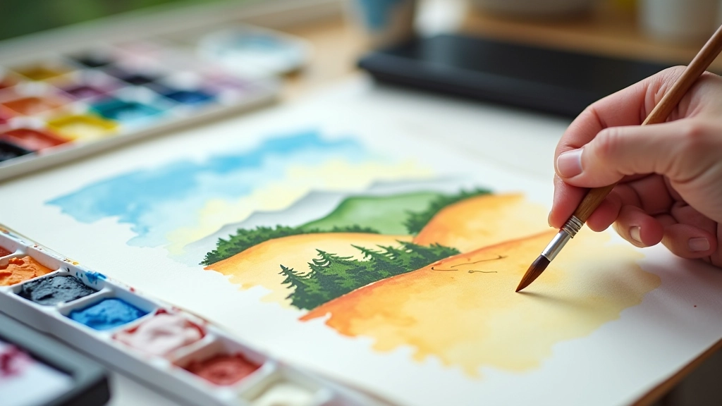
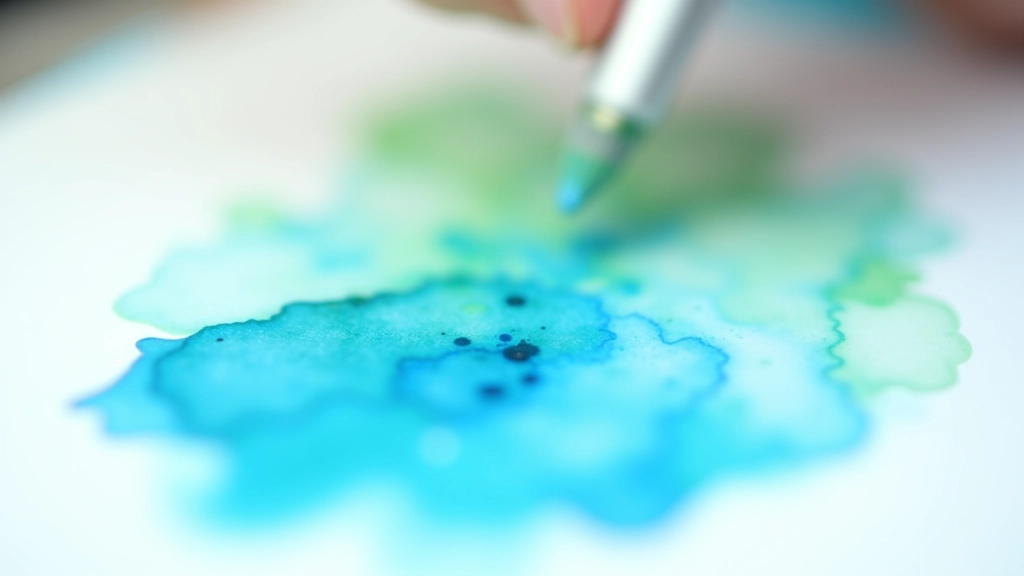
Wet-on-wet is the foundation for landscape painting. You're essentially painting on damp paper, which lets colors flow and blend without harsh lines. This is perfect for skies, water, and distant hills where you don't want sharp edges.
How It Works
- Wet your entire paper with clean water using a large brush — the paper should glisten but not have puddles
- Drop in your lightest colors while the paper is still wet — they'll spread and soften naturally
- Add darker colors or secondary hues while it's still damp, not dripping wet
- Let gravity and the water do the work — resist the urge to overwork it
The challenge is timing. Too wet and your colors become muddy. Too dry and you get hard edges. Most painters learn this through trial and error — you'll probably waste a few sheets of paper before you get the feel for it. That's completely normal.
Colors That Work for British Scenery
You don't need dozens of colors. The best landscape painters actually use a fairly limited palette. For British landscapes, you're working with muted, earthy tones — greens aren't bright, skies aren't brilliant blue, and grays play a huge role.
A solid foundation includes:
- Raw Sienna and Burnt Sienna for warm earth tones
- Ultramarine Blue and Cerulean for sky and water
- Yellow Ochre for muted greens when mixed
- Payne's Grey or Neutral Tint for shadows without pure black
- Viridian or Sap Green for vegetation, mixed with ochre to tone it down
The key is mixing. Rather than using green straight from the tube, mix yellow with blue to get a color that feels alive. Add a touch of red to kill the brightness. This takes practice, but it's where the real magic happens. You'll start seeing subtle variations in greens that you never noticed before.
Building Atmospheric Perspective
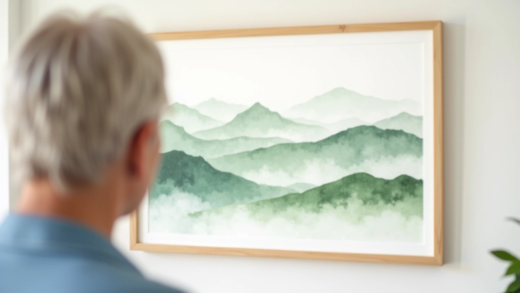
Distance in landscape painting isn't just about scale — it's about color and clarity. Things that are far away appear lighter, cooler, and less detailed than things up close. This is atmospheric perspective, and it's what makes a flat 2D painting feel like it has real depth.
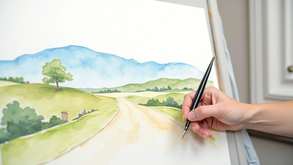
In practice, this means your distant hills should be paler and more blue-gray than your foreground. The middle ground bridges them. Don't put detail in the distance — a suggestion of trees or fields works better than painting individual elements. Save your crisp details and warm colors for the foreground where the eye naturally lands.
A lot of beginners make everything equally detailed and equally saturated with color. That's what makes paintings look flat and lifeless. Pull back the saturation as you recede into the distance, and suddenly your painting has breathing room.
Practical Tips That Actually Help
Use Quality Paper
Paper matters more than you'd think. Cheap paper falls apart when wet. Invest in at least 140gsm cold-pressed paper — it'll handle water and rewetting much better.
Mix Generously
Don't be stingy with water when mixing. Watery, transparent colors layer better than thick, opaque ones. Transparency is watercolor's superpower.
Less Detail = More Impact
Suggestion beats realism. A few brushstrokes implying trees work better than painting every leaf. Your viewer's imagination fills in the gaps.
Let It Dry Between Layers
Don't rush. Watercolor layers best when the previous layer is completely dry. A hair dryer speeds this up if you're impatient.
Study Real Landscapes
Paint from observation or good reference photos. You'll learn how light actually behaves on hills, fields, and water much faster than painting from imagination.
Know When to Stop
Overworking kills watercolors. If you've got a good painting at 70% done, stop there. The white paper and transparent washes are doing the work.
About This Guide
This article is educational and informational. While these techniques are based on traditional watercolor practice, individual results vary depending on skill level, materials used, and personal artistic choices. Different artists develop different approaches — what works for one painter might not work exactly the same way for another. The best learning happens through experimentation and practice. Consider these guidelines as starting points rather than rigid rules to follow.
Getting Started With Your First Landscape
You don't need to be perfect. You need to start. Pick a simple landscape — maybe a hillside with a few trees, or a lake with distant mountains. Set aside an hour without distractions. Wet your paper, drop in some colors, and see what happens.
Your first few paintings probably won't look like you imagined. That's completely fine. Every painter's gone through this. The ones who stuck with it did so because they enjoyed the process, not because they got instant results. Watercolor rewards patience and playfulness in equal measure.
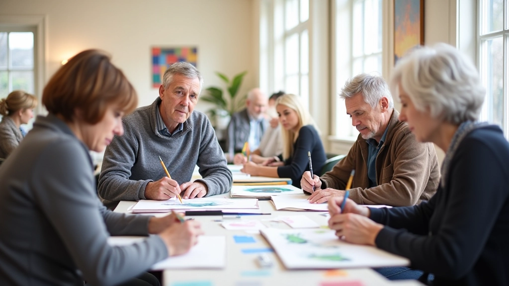
If you're looking for community and feedback on your work, consider joining a local U3A group or art circle. Painting alongside other people, even at a beginner level, accelerates your learning more than practicing alone. You'll see different approaches, get encouragement, and discover you're not the only one figuring this out.
Ready to explore more about getting involved in art communities?
Learn About U3A Art GroupsExplore More Drawing Guides